01 / Selected workMobility · 0→1 service and product
BlueSG
More cars were not the answer. Better parking certainty was.
I led discovery and delivery for a charger-less parking model that removed a fleet-growth constraint while making vehicle and return-station availability easier for customers to understand.
Service DesignProduct DesignUX Research
My role
Lead Product Designer — research, service-design strategy, workshops, user flows, hi-fi design and validation
Scope
Discovery → launch
Focus
Double Diamond · Mobility · 0→1
Evidence status
Funnel movement and weekly rentals were observed after launch; usability evidence came from four sessions across ten prototype tasks.
Post-launch and usability evidence
+14%weekly rentals within two weeks
64% → 45%home-map to reservation drop
76.59System Usability Scale
01 · Project overview
What I owned—and the environment around the work
A concise project brief that makes my individual contribution, collaborators and definition of success clear before the detailed process.
01Business context
BlueSG had EVs available for growth, but dependence on third-party charging locations restricted where the fleet could operate.
02My ownership
I led the Double Diamond from discovery and cross-functional alignment through service design, user flows, prototyping, usability testing and launch measurement.
03Core collaborators
Eight participants across Product, Operations, Management and delivery functions joined the core Assumption Smash and service-definition work.
04Success definition
Expand the parking model, make reservation and return more understandable, protect operational control and improve rental conversion.
02 · Problem
The decision behind the screens
BlueSG owned enough EVs, but third-party charging infrastructure limited where those vehicles could operate. Users also faced high cognitive load and uncertainty when reserving and returning cars.
Charging-point operators covered too few Singapore locations for fleet growth.
Operations teams struggled with abandoned vehicles and return exceptions.
The reservation flow produced high drop-off and support volume.
Usability and accessibility issues made availability feel worse than it was.
The constraint wasn’t the number of cars. It was the certainty of where they could be returned.
03 · Discovery evidence
Three signals changed the shape of the problem
I connected behavioural, operational and qualitative evidence before choosing a solution. Each signal created a concrete design implication.
01Product analytics
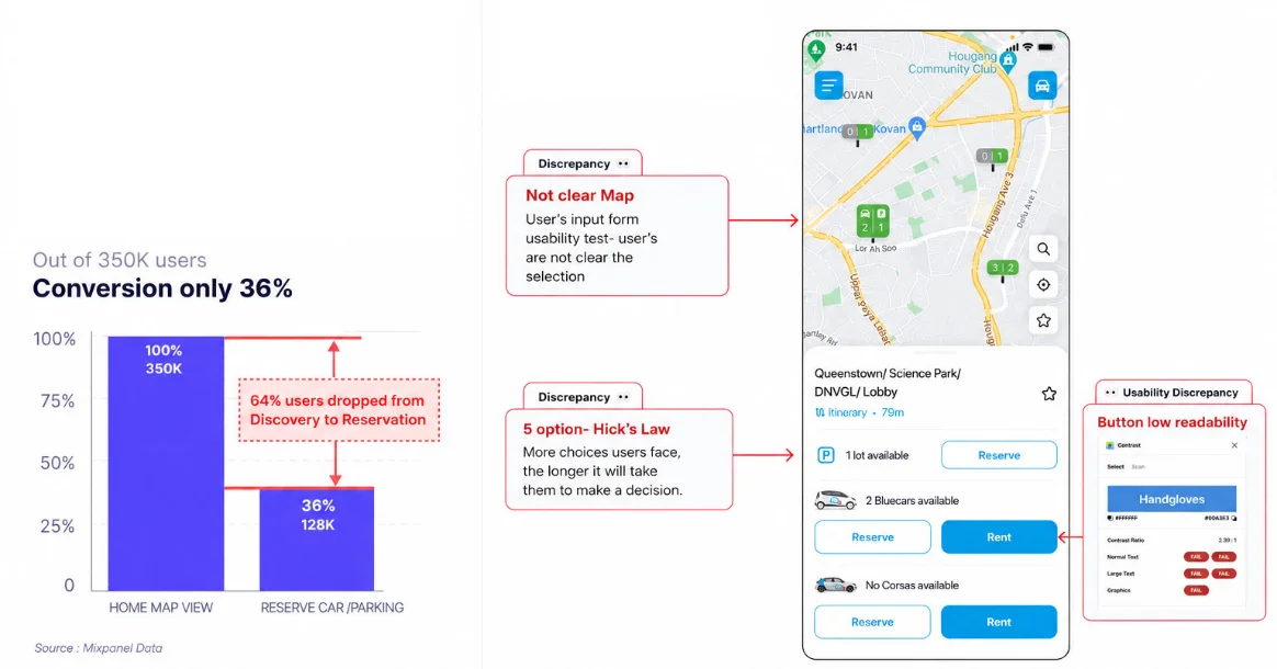
Only 36% of 350K home-map visits progressed to reserving a car or parking location; 64% dropped before reservation.
Design implication
Perceived availability was partly an information and decision-load problem—not only a fleet problem.
02Experience audit
Unclear map states, five competing options and low-readability controls made it harder to choose with confidence.
Design implication
The product needed fewer decisions, clearer availability and stronger accessibility.
03Assumption Smash
Eight cross-functional participants spent 180 minutes exposing unknowns around charging, station operations and reliable end-rental confirmation.
Design implication
The solution had to work as an operational service before it could work as a UI flow.
04 · Service system
The experience only works when the backstage works
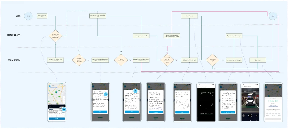
The blueprint keeps the customer journey, visible product behaviour and operational responsibilities connected across the same sequence.
StageCustomerFrontstageBackstage
1 · Discover
Looks for an available car and a workable destination.
Map and station information distinguish what can be reserved and returned.
Availability rules combine vehicle, battery and parking-station states.
2 · Reserve
Chooses a car with confidence that the journey can be completed.
A simplified reservation flow reduces competing choices.
The system holds the correct vehicle and destination conditions.
3 · Drive
Travels with a clear understanding of the return model.
Guidance prepares the customer for a charger-less return.
Operations can see the rental and expected parking location.
4 · Return
Parks and scans the station QR code to confirm the location.
The app guides scan, evidence capture and end-rental confirmation.
The system verifies the station and flags exceptions for operations.
5 · Rebalance
Receives a clear completed-rental state.
A visible confirmation removes ambiguity and repeat attempts.
Operations can manage vehicles, stations and exceptions beyond charging-only locations.
Scroll horizontally on smaller screens to follow the complete service.
The artefacts were useful because they helped the team make choices. This is the evidence-to-decision trail behind the final experience.
01
Question
Was fleet size really the constraint?
Evidence
BlueSG had vehicles, but charging-site coverage limited where they could operate.
Decision
Expand the service model to charger-less parking rather than treating vehicle acquisition as the answer.
02
Question
How should a return location be confirmed?
Evidence
Hardware options differed in installation effort, cost and lead time.
Decision
Use a QR-based proof of concept as the quickest practical path to reliable end rental.
03
Question
Is this a customer-flow or operations problem?
Evidence
Abandoned vehicles, exceptions and system states crossed customer, product and operations boundaries.
Decision
Design one future-state journey with both user and operational lanes.
Cross-functional discovery turned operational assumptions into testable design requirements.
The future-state service was translated into a clear customer flow before visual design.06 · Two connected lenses
Service Design and Product Design, deliberately connected
I treated the operating experience and the interface as one system. Each lens solved a different part of the same problem.
Service Design
Shaping the ecosystem, hand-offs and operating model.
Aligned product, operations and management in an Assumption Smash
Mapped the future customer and operations journey together
Evaluated end-rental hardware against cost, effort and lead time
Designed the operating model for charger-less stations
Product Design
Turning service decisions into clear, usable product behaviour.
Reduced cognitive load in discovery and reservation
Designed the QR-based end-rental interaction
Mapped end-to-end flows and rapid wireframes
Validated a functional high-fidelity prototype across 10 tasks
07 · Process
From ambiguity to a decision the team could act on
01
Separate facts from assumptions
Facilitated a three-hour Assumption Smash with eight cross-functional participants. The output exposed the unknowns that mattered: perceived availability, charging requirements, station operations and reliable end-rental confirmation.
02
Design the service first
Mapped a future-state journey across customer and operations touchpoints. QR-based end rental emerged as the best proof-of-concept option after comparing installation effort, cost and time to launch.
03
Shape the product flow
Translated the service decisions into reservation, driving and return flows, then used wireframes to resolve decision points before investing in visual design.
04
Validate and measure
Ran four usability sessions across ten tasks, iterated on errors and comprehension, and instrumented the shipped journey with Mixpanel for drop rate and time-on-task monitoring.
08 · Validate the design
Usability testing the high-fidelity prototype
I built a fully functional Figma prototype, recruited participants who matched the study criteria and used task-based testing to validate whether people could understand availability, choose a location and move confidently towards a reservation.
01Prototype
A functional high-fidelity Figma prototype covering the critical parking-discovery and reservation journey.
02Participants
Four participants recruited against the study criteria, giving focused qualitative evidence on comprehension and interaction behaviour.
03Test plan
Ten realistic tasks designed to expose uncertainty around selecting a station, understanding availability and progressing to reservation.
04Analysis
I combined observation, task time, errors, task ratings and SUS, then mapped every material issue directly into the next iteration.
<22.5saverage time on task
2.5%user error rate
3.95/5average task rating
76.59System Usability Scale
Finding → iteration
What changed after the sessions
01
Observed friction
The selected station was easy to lose within a visually dense map.
Design response
Strengthened the selected-location state and surfaced the station name and address as a single, scannable block.
02
Observed friction
Vehicle and parking information competed for attention at the moment of choice.
Design response
Created a clearer information hierarchy, with progressive details for the car and the available parking options.
03
Observed friction
The primary action did not make the consequence of the current selection explicit enough.
Design response
Made the main call to action respond to the selected station or vehicle and kept it consistently visible at the end of the decision path.
With four sessions, I treated the results as directional usability evidence rather than population-level proof. The value was in finding repeated friction quickly, improving the design and pairing the prototype results with post-launch behavioural data.
09 · Validated UI outcome
Turning validated findings into a connected rental journey
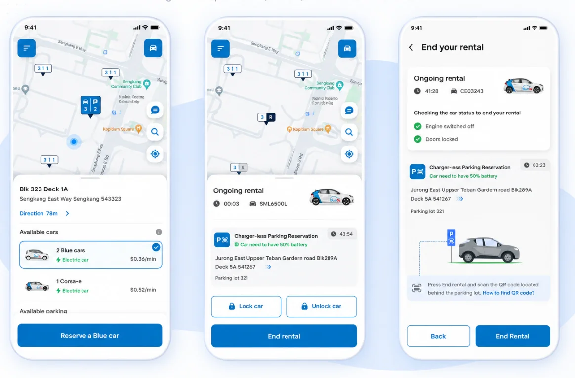
The final interface connected three moments that previously felt fragmented: choosing a charger-less station, keeping the return reservation visible during the rental and completing end rental with clear vehicle checks and QR guidance.
Selected high-fidelity screens from the charger-less parking journey, moving from availability and reservation to active-rental reassurance and end-rental confirmation.
01
Choose with confidence
Station, vehicle and parking availability are grouped around one clear reservation decision.
02
Stay oriented
The reserved return location and battery requirement remain visible throughout the active rental.
03
Finish without ambiguity
System checks, parking context and QR instructions make the end-rental sequence explicit.
10 · Constraints and trade-offs
What made the work difficult—and how I responded
These constraints shaped the solution, the order of work and the compromises I made with the wider team.
01
Third-party infrastructure
The tension
The product team could not simply add charging locations wherever customer demand existed.
My response
We separated parking confirmation from charging infrastructure and designed charger-less stations as a new service type.
02
Hardware cost and lead time
The tension
A robust physical solution could delay the pilot and increase installation effort.
My response
I compared options against effort, cost and launch time; QR confirmation offered the strongest proof-of-concept balance.
03
Operational exceptions
The tension
A simple customer flow still had to handle wrong locations, incomplete evidence and abandoned vehicles.
My response
The future-state journey included system checks and operations exception paths instead of hiding complexity behind the happy path.
11 · Evidence
Evidence that moved the work forward
<22.5saverage task time
2.5%user error rate
3.95/5average task rating
10prototype tasks tested
Funnel movement and weekly rentals were observed after launch; usability evidence came from four sessions across ten prototype tasks.
Expanded the operating model beyond charging-only stations.
02
Reduced reservation drop-off while increasing weekly rentals.
03
Gave operations a practical, lower-cost way to manage return locations.
04
Created a measurement plan covering conversion, idle time and support volume.
13 · Reflection
Looking back and ahead
Strongest contribution
I made the physical parking model, digital end-rental flow and operations workflow one design problem rather than three separate workstreams.
What I learned
The Assumption Smash prevented the team from optimising the reservation UI before agreeing how a charger-less return could be verified and operated.
What I would do next
I would run a staged station pilot and track end-rental success, exception rate, vehicle idle time, redistribution effort and support contacts by station type.