Make the best specialist obvious—without hiding the why.
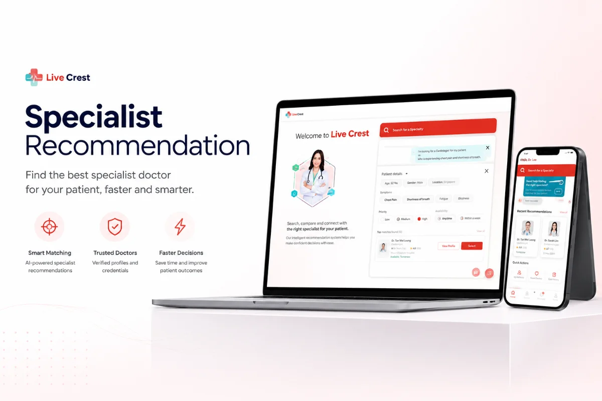
I designed an explainable recommendation layer that brings specialty, location, availability, language and coverage into the agent’s existing booking flow.
Product DesignService DesignDecision Support
My role
Lead Product Designer — problem framing, research, recommendation logic, interaction design and validation
Scope
Discovery → validation
Focus
Recommendation · Explainable UX · Healthtech
Evidence status
This case shows validated direction and workflow evidence. I do not claim a post-launch business metric until production measurement is available.
Validated scope—not post-launch impact
5matching signals unified
1embedded decision surface
Human-ledfinal provider choice
01 · Project overview
What I owned—and the environment around the work
A concise project brief that makes my individual contribution, collaborators and definition of success clear before the detailed process.
01Product context
The recommendation capability extended the medical-concierge platform after the core case workflow had been structured and digitised.
02My ownership
I framed the decision problem, mapped matching signals, defined explainability requirements and designed the embedded recommendation-to-booking flow.
03Core collaborators
Concierge agents, operational and clinical stakeholders, Product and Engineering shaped the rules, exceptions and feasible workflow.
04Success definition
Help agents compare suitable providers more consistently and confidently without creating a black box or another tool to manage.
02 · Problem
The decision behind the screens
Provider choice depended on individual memory and signals scattered across tools. Under time pressure, inconsistent decisions caused slower confirmations and avoidable re-referrals.
Provider selection relied on tacit knowledge held by individual agents.
Specialty, location, availability, language and insurance lived in different places.
Inconsistent matches created re-referrals and slower confirmations.
A separate tool would have added friction to an already complex workflow.
Decision support should increase confidence, not take accountability away from the person doing the work.
03 · Discovery evidence
Three signals changed the shape of the problem
I connected behavioural, operational and qualitative evidence before choosing a solution. Each signal created a concrete design implication.
01Frontline decision-making
Experienced agents carried provider knowledge in memory, making speed and consistency dependent on who handled the case.
Design implication
The interface needed to externalise useful judgement without pretending every case had one automatic answer.
02Scattered matching data
Specialty, location, availability, language and coverage were reviewed across separate information sources.
Design implication
The highest-value product move was to unify the comparison at the moment of choice.
03Workflow observation
Agents were already operating inside a case flow under time pressure; switching to a standalone recommendation tool would add friction.
Design implication
Decision support needed to sit inside the existing case and lead directly into booking.
04 · Service system
The experience only works when the backstage works
The blueprint keeps the customer journey, visible product behaviour and operational responsibilities connected across the same sequence.
StageCustomerFrontstageBackstage
1 · Interpret need
The patient’s referral, preferences and constraints define the request.
The request is clarified before provider options are presented.
The agent confirms specialty, urgency, coverage and preference context.
2 · Screen options
Only relevant providers should remain in consideration.
Unsuitable options are filtered from the comparison.
Rules apply specialty, coverage, location, language and availability signals.
3 · Compare
Trade-offs become easier to discuss and understand.
A ranked view exposes the most relevant options and why they fit.
Signal-level rationale supports, rather than replaces, agent judgement.
4 · Decide
A suitable provider is selected with clear reasoning.
The agent can review, override and explain the recommendation.
The final choice and exception reasoning remain accountable.
5 · Book
The selected option progresses into appointment coordination.
The recommendation connects directly to booking actions.
The existing case and ticket workflow continues without a separate hand-off.
Scroll horizontally on smaller screens to follow the complete service.
05 · Decision trail
Complexity, compressed into three decisions
The artefacts were useful because they helped the team make choices. This is the evidence-to-decision trail behind the final experience.
01
Question
Should the system choose the provider?
Evidence
Patient preferences, clinical context and operational exceptions could not be reduced to one deterministic answer.
Decision
Rank and explain suitable options while keeping the final decision with the agent.
02
Question
How much rationale should be visible?
Evidence
A score alone would be difficult to trust, explain or override responsibly.
Decision
Expose the matching signals behind each recommendation at the comparison point.
03
Question
Where should the feature live?
Evidence
Agents already had a complex case workflow and could not absorb another destination or tool.
Decision
Embed recommendations inside the case flow with a direct continuation into booking.
06 · Two connected lenses
Service Design and Product Design, deliberately connected
I treated the operating experience and the interface as one system. Each lens solved a different part of the same problem.
Service Design
Shaping the ecosystem, hand-offs and operating model.
Identified where provider choice sat in the wider referral service
Mapped the signals and operational constraints behind a good match
Preserved human judgement for exceptions and complex patient needs
Reduced hand-offs by placing guidance in the existing agent journey
Product Design
Turning service decisions into clear, usable product behaviour.
Designed a ranked provider view using relevant matching signals
Made recommendation rationale visible and explainable
Connected the recommendation directly to booking actions
Kept agents in control instead of presenting a black-box answer
07 · Process
From ambiguity to a decision the team could act on
01
Frame the decision
Focused the problem on the judgement agents make—not merely the provider data they search. This clarified which signals mattered and where guidance would create value.
02
Surface the signals
Brought specialty fit, location, availability, language and coverage into a single ranked view so agents could compare options without switching tools.
03
Explain the match
Made the rationale for every recommendation visible. Agents could assess the evidence, handle exceptions and remain accountable for the final choice.
04
Fit the workflow
Placed recommendations inside the case flow with a direct path into booking, turning decision support into acceleration rather than another step.
08 · Design evolution
From conversational skeleton to recommendation experience
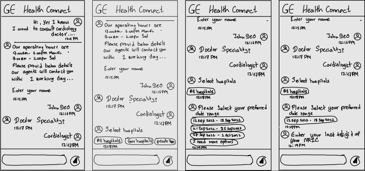
I used low-fidelity flows to test the order of questions and decision points before visual design. The high-fidelity experience then translated that logic into a branded, guided journey from patient intake to a confident specialist selection.
01 · Low-fi exploration
Test the conversation before styling the interface
The first sketches modelled the concierge as a progressive conversation. Each response unlocked the next relevant question, keeping the interaction focused while showing how specialty, hospital and preferred dates would shape the recommendation.
Early conversational wireframes used quick replies and staged questions to test the intake sequence before committing to detailed interface design.
Ask one contextual question at a time instead of presenting a long intake form.
Use quick-select options for hospital and preferred dates to reduce typing and ambiguity.
Keep previous answers visible in the conversation so the agent and patient retain context.
02 · High-fi delivery
Make patient intent, availability and provider choice actionable
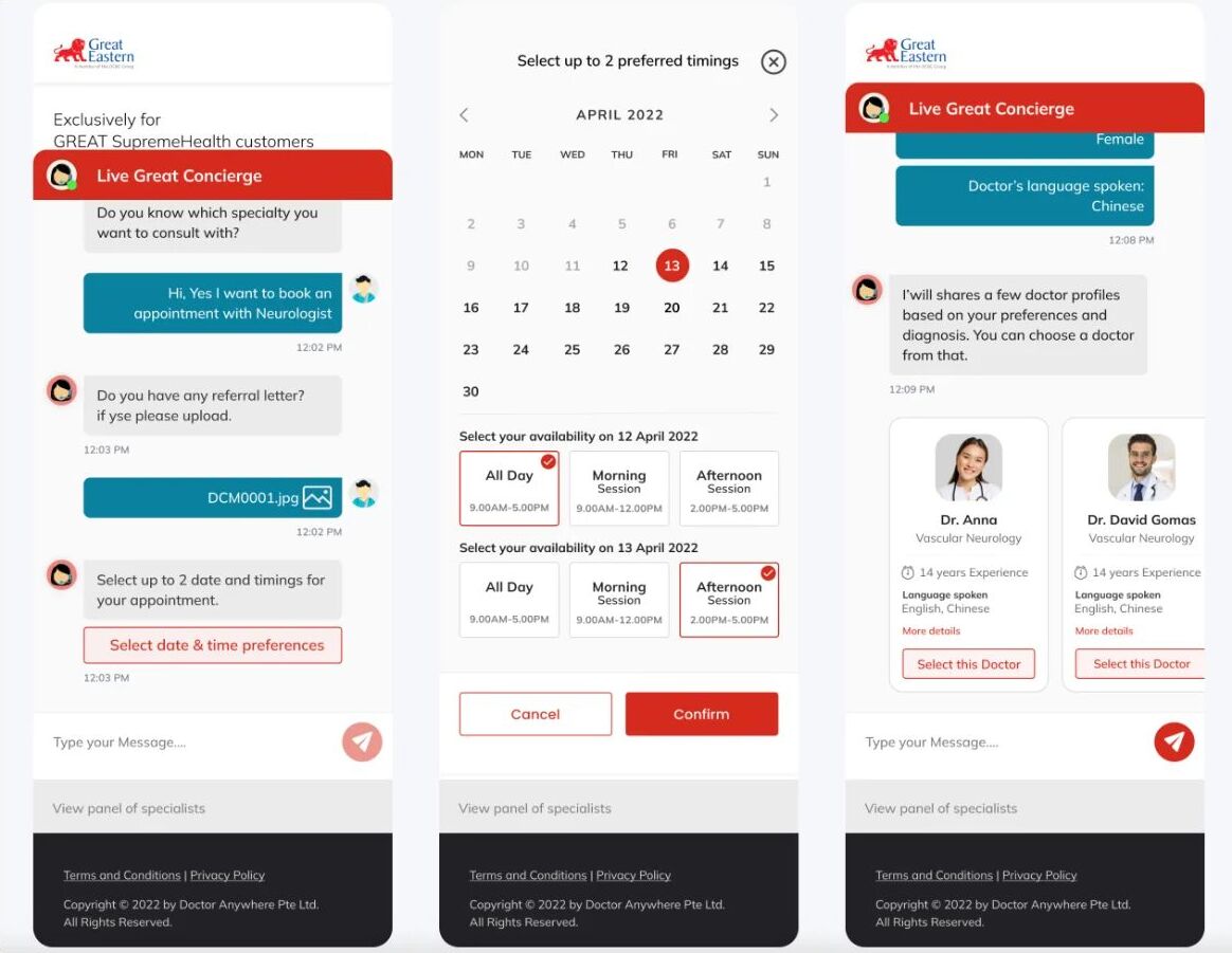
The final direction combined conversational intake with focused task surfaces. Patients could upload a referral, choose up to two preferred time windows and compare recommended specialists without leaving the concierge journey.
High-fidelity screens connected referral evidence, availability preferences and specialist comparison into one continuous recommendation-to-booking flow.
Keep referral upload inside the conversation so clinical context travels with the request.
Let patients provide more than one availability window to improve the chance of a workable match.
Present comparable doctor cards with specialty, experience, language and a direct selection action.
09 · Constraints and trade-offs
What made the work difficult—and how I responded
These constraints shaped the solution, the order of work and the compromises I made with the wider team.
01
Incomplete or changing provider data
The tension
A recommendation can only be as dependable as availability, coverage and provider information.
My response
The experience exposed the signals used and preserved agent review rather than presenting certainty the data could not guarantee.
02
High-stakes explainability
The tension
A black-box ranking could reduce trust and make exceptions harder to handle.
My response
Each recommendation showed why it matched, allowing the agent to compare, explain and override it.
03
Workflow load
The tension
Extra screens or tools could cancel out the time saved by recommendation logic.
My response
The feature reused the existing case context and connected the selected provider directly to the next booking action.
10 · Evidence
Evidence that moved the work forward
5matching signals unified
1ranked decision surface
0extra tools required
Humanfinal judgement retained
This case presents validated design direction and workflow evidence. I do not claim a post-launch business metric until production measurement is available.
11 · Outcome
What changed
01
Turned a memory-dependent decision into guided, evidence-based matching.
02
Made recommendations explainable rather than opaque.
03
Reduced the cognitive load of comparing provider options.
04
Extended the concierge platform without fragmenting the agent workflow.
12 · Reflection
Looking back and ahead
Strongest contribution
I designed the recommendation as accountable decision support—combining useful ranking with transparent rationale and human control.
What I learned
In a sensitive service, explainability is not supporting copy; it is a core interaction requirement that enables trust and exception handling.
What I would do next
I would validate and monitor time-to-match, override rate, re-referral rate, booking completion and the reasons agents reject a recommendation.