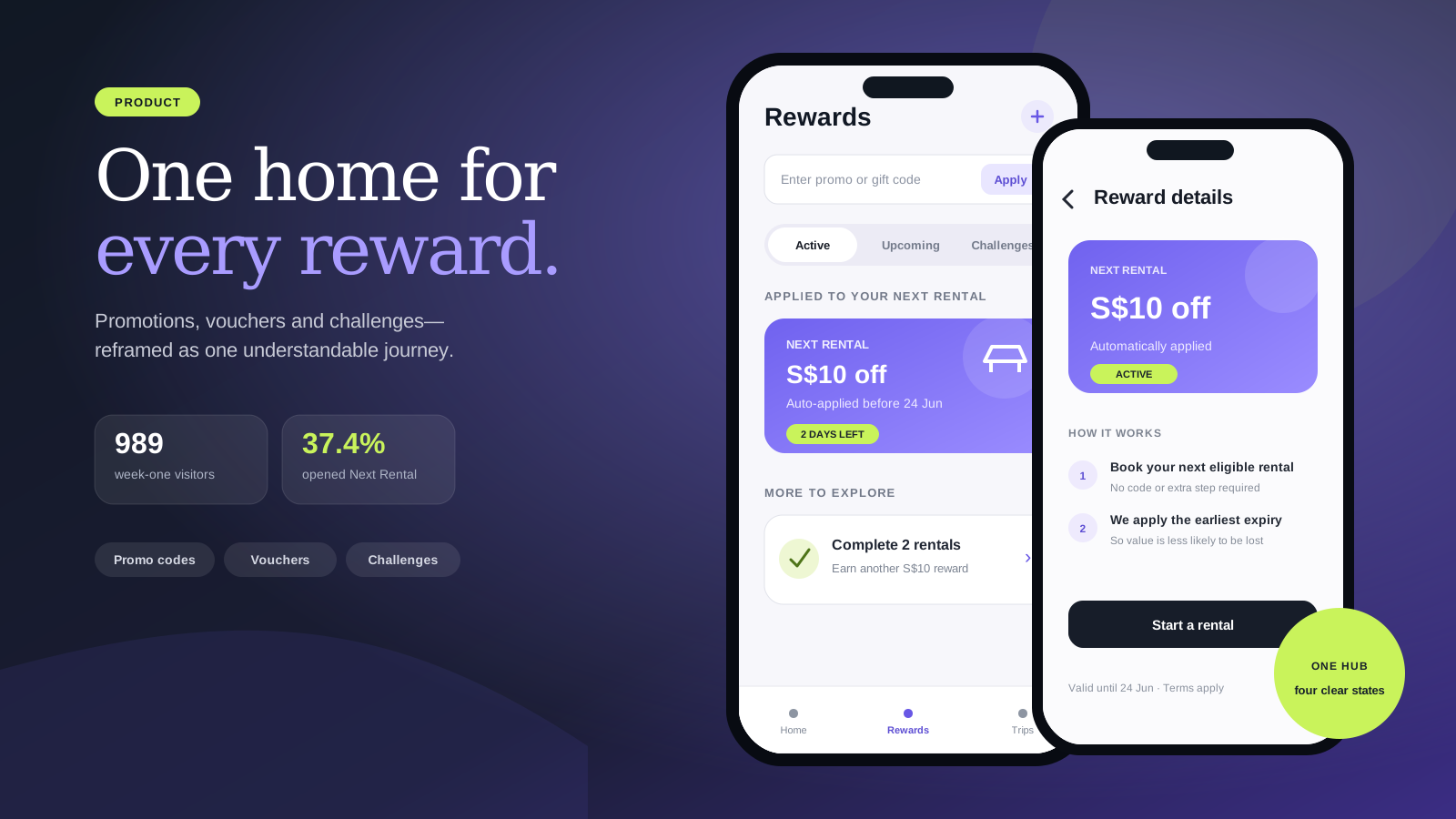
Two hidden reward paths became one habit-forming hub.
I led a focused discovery and product-design sprint that consolidated promotions, vouchers and challenges into one Rewards hub—then used first-week analytics to understand how customers explored each reward state.
Product DesignService DesignUX Research
My role
Lead Product Designer — experience audit, competitor analysis, naming strategy, hypothesis, information architecture, flows, hi-fi design and launch measurement
Scope
Mini discovery → 1-week post-launch
Focus
Rewards · Behaviour design · Mobile product
Evidence status
The Miro source contains the original discovery and first-week event funnels. These are early behavioural signals from release—not a claim about long-term retention or revenue impact.
Measured first-week product behaviour
989Rewards visitors in week one
37.4%opened Next Rental rewards
29.2%explored Challenges
01 · Project overview
What I owned—and the environment around the work
A concise project brief that makes my individual contribution, collaborators and definition of success clear before the detailed process.
01Product context
A Singapore mobility app needed to make issued vouchers, promo codes and engagement challenges easier to find and understand before a rental.
02My ownership
I led the focused discovery from audit and competitor review through naming, hypothesis, state model, flows, hi-fi design and post-launch event analysis.
03Core collaborators
Product and Engineering partners shaped feasibility, while CX themes and product analytics informed the problem and first-week readout.
04Success definition
Create one understandable destination, increase pre-rental reward discovery and give the team measurable signals for the next iteration.
02 · Problem
The decision behind the screens
Customers encountered promotions across two disconnected entry points: one page for entering promo codes and another for seeing issued vouchers. The split mental model made rewards hard to discover, expiry and eligibility unclear, and auto-applied voucher logic difficult to trust.
Promotions and vouchers lived in separate locations with different verbs and no shared mental model.
The existing experience supported redemption, but offered almost no pre-rental discovery.
Voucher cards lacked enough context about purpose, eligibility and expiry.
Soonest-expiry auto-application happened through system logic customers could not see or control.
The breakthrough was not a new voucher card. It was giving every reward one understandable place in the customer journey.
03 · Discovery evidence
Three signals changed the shape of the problem
I connected behavioural, operational and qualitative evidence before choosing a solution. Each signal created a concrete design implication.
01Current-experience audit
Customers entered a promo code from Promotions but found issued vouchers inside payment, forcing them to remember two navigation paths and two different meanings.
Design implication
The information architecture needed one destination organised around customer value—not internal reward types.
02Singapore competitor review
Grab, FairPrice+ and similar services had already taught customers to look for a wallet-style Rewards destination for benefits earned through the app.
Design implication
Using the familiar Rewards label could lower learning friction while remaining broad enough for future loyalty mechanics.
03Voucher and CX friction
Minimal descriptions, weak expiry cues and invisible auto-apply logic left customers unsure what a voucher was for, when it would expire and why it had been used.
Design implication
Every state needed clearer context, urgency and an explanation of what the system would do next.
04 · Service system
The experience only works when the backstage works
The blueprint keeps the customer journey, visible product behaviour and operational responsibilities connected across the same sequence.
StageCustomerFrontstageBackstage
1 · Discover
Notices a reward from navigation, a home nudge, a notification or the rental flow.
Each entry point leads to the same Rewards destination and preserves the customer's intent.
Campaign, voucher and eligibility data resolve to the correct reward state.
2 · Orient
Understands what can be used now, later or through a challenge.
Active, Upcoming, Challenges and History organise the hub around action and timing.
Reward status, validity and customer eligibility determine where each item appears.
3 · Understand
Checks value, eligibility, expiry and how the reward will be applied.
Cards and details expose the information needed to decide with confidence.
Terms, expiry and auto-apply rules are translated into customer-facing language.
4 · Activate
Enters a promo code, accepts a challenge or proceeds toward a qualifying rental.
A prominent code field and clear calls to action reduce the activation threshold.
Validation returns success, eligibility or error states without breaking the journey.
5 · Use and learn
Uses the reward on a rental or reviews a used or expired item later.
Applied status and history make the system's behaviour visible after the event.
Event instrumentation tracks exploration and activation for iteration.
Scroll horizontally on smaller screens to follow the complete service.
The artefacts were useful because they helped the team make choices. This is the evidence-to-decision trail behind the final experience.
01
Question
What should the destination be called?
Evidence
Promotions described marketing, while Vouchers described only one reward type. Singapore customers already recognised Rewards as the broader mental model.
Decision
Use Rewards as the single scalable label for codes, vouchers, challenges and later loyalty mechanics.
02
Question
How should customers enter the hub?
Evidence
A menu-only destination would improve structure but would not create a pre-rental discovery habit.
Decision
Combine a persistent navigation entry with contextual nudges from home, notifications and the rental flow.
03
Question
How much of the reward lifecycle should be visible?
Evidence
Hiding used or expired items removed context, while invisible auto-apply logic created distrust.
Decision
Expose active, upcoming, challenges and history, with expiry and auto-application explained at card and detail level.
The structural move: replace two disconnected destinations with one hub reached from persistent and contextual entry points.
First-week event funnels created a measurable baseline for where customers explored and where activation remained weak.06 · Two connected lenses
Service Design and Product Design, deliberately connected
I treated the operating experience and the interface as one system. Each lens solved a different part of the same problem.
Service Design
Shaping the ecosystem, hand-offs and operating model.
Connected reward discovery to navigation, home nudges, notifications and the rental journey
Made the system's auto-apply logic visible before the next rental
Separated active, upcoming, used and expired states around customer intent
Kept reward history available so customers could understand what had happened
Product Design
Turning service decisions into clear, usable product behaviour.
Replaced fragmented Promotions and Vouchers destinations with one Rewards hub
Selected a scalable label that could cover codes, vouchers, challenges and future loyalty
Added context, eligibility and expiry urgency to reward cards
Kept promo-code entry prominent while making reward browsing the primary experience
07 · Process
From ambiguity to a decision the team could act on
01
Audit the two-path experience
Mapped where customers entered promo codes, where they discovered issued vouchers and where the journey lost context. The audit reframed the problem from 'improve a page' to 'repair the reward mental model'.
02
Benchmark the learned behaviour
Reviewed Grab, Gojek, GetGo and Lyft patterns, then compared Promotions, Vouchers and Rewards against familiarity, emotional tone, scope and future extensibility.
03
Write a measurable hypothesis
Defined the bet: one central hub with clear reward details, urgency and prominent code entry would increase pre-rental discovery, redemption behaviour and confidence while reducing voucher-related questions.
04
Design entries, states and flows
Mapped direct navigation, home and notification nudges, rental-flow entry, voucher details, code application, challenges and used or expired history before moving into high-fidelity design.
05
Read the first-week behaviour
Used event funnels to see which states customers explored: Next Rental, Upcoming, promo-code Apply, Challenges and Used or Expired. The readout established a launch baseline rather than overstating long-term impact.
08 · Constraints and trade-offs
What made the work difficult—and how I responded
These constraints shaped the solution, the order of work and the compromises I made with the wider team.
01
One hub, many reward mechanics
The tension
A single destination could become a catch-all that made vouchers, codes and challenges harder to scan.
My response
I organised the hub around customer timing and intent—what can be used now, what is coming, what can be earned and what already happened.
02
Automation versus control
The tension
Soonest-expiry auto-application protected value but felt arbitrary when the rule remained invisible.
My response
I kept the operational logic while surfacing which reward would be applied, why and when.
03
Discovery versus rental focus
The tension
More reward entry points could create noise inside a task-oriented mobility product.
My response
I used contextual nudges and a stable hub rather than forcing the complete reward experience into the rental flow.
09 · Evidence
Evidence that moved the work forward
989first-week Rewards visitors
370 · 37.4%opened Next Rental
318 · 32.2%opened Upcoming
289 · 29.2%opened Challenges
253 · 25.4%reviewed Used or Expired
39 · 3.9%clicked Apply promo code
First-week Mixpanel funnels shown on the source board. Event counts and percentages describe early exploration among roughly 989–995 observed visitors; they do not establish retention, revenue or causal lift.
The final UI turned reward rules into clear customer decisions
These connected mobile states show the product-design value behind the new information architecture: customers can see what applies now, what is coming next and why a specific voucher will be used.
01 · Next rental
Make the next benefit obvious
The primary state answers the most urgent question first: which reward will apply now. Eligibility, remaining value and expiry sit together so customers can act without opening every voucher.
The detail sheet confirms auto-application, benefit, expiry and key terms in one focused view—making an automated rule feel transparent rather than arbitrary.
Consolidated Promotions and Vouchers into one understandable Rewards destination.
02
Established Next Rental as the most explored state in week one, opened by 370 visitors (37.4%).
03
Created meaningful discovery beyond issued vouchers: 318 visitors opened Upcoming and 289 explored Challenges.
04
Made the full lifecycle visible, with 253 visitors reviewing Used or Expired rewards during the first week.
12 · Reflection
Looking back and ahead
Strongest contribution
I turned a fragmented navigation problem into a coherent product model, then connected the model to first-week evidence instead of ending the story at polished screens.
What I learned
Naming was a product decision: choosing Rewards created room for vouchers, codes and challenges while aligning with an existing Singapore customer mental model.
What I would do next
I would compare repeat visits, reward activation and rental conversion by entry point, then test whether expiry nudges and challenge progress create durable habits beyond launch week.